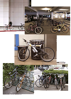
It is my pleasure to announce the official winners of the 2007 Bicycle Fixation Great Bike Rack Hunt! It was a lot of fun coordinating this contest, and I was pleased by the variety of racks submitted. Without any further ceremony, here are the winners:
Wins a pair of Classic Wool Knickers for Chris Orr!
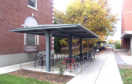
People's Choice Winner
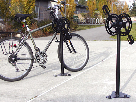
Wins a pair of Hemp City Knickers for Steve Neff!
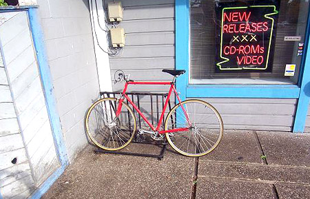
"Lanterne Rouge" (for the worst rack)
Wins a James Black Hat for Chris Orr!
Honorable mention must go out to Mr. Christopher Rampton (#9 below). In the public voting there were two competitors who broke away from the pack, and he was one of them. Moreover, several judges applauded the materials he used. "Kudos for creative reuse of materials!" remarked one. Nice work, Christopher.
Other racks got attention from both the public and the judges. All the various emblematic racks, from bridges to cars, to the seemingly ubiquitous bicycle shape, were enjoyed by all. The dinosaur was proclaimed "witty," and the caribou, "cute."
It was with equal that pleasure Rick and I received each entry, good and bad. Some of the designs were quite creative, and we were split on choosing our personal front runners. Others were appallingly counterproductive, and once again we were split. Thank goodness we left the decision making to our readers and judges.
On behalf of everyone here at Bicycle Fixation (both of us), and our judges, I want to thank everyone who submitted a photograph. Because of you we were able to have a public dialog about bicycling infrastructure in general, and bicycle parking in specific. Without sensible parking, the success of everything else one might do to encourage bicycle riding will be held back, or even fail outright.
More than that, together we have shined a light on what is acceptable bicycle parking both in terms of functionality and esthetics, highlighting that good parking should have plenty of both. Then, by extension, we have highlighted why much bike parking fails.
Let me not be remiss by overlooking all of you who participated in the People's Choice survey. Your active participation in this added greatly to the discussion!
The Choices
Mr. Orr and his practical rack received good marks from the judges, with strong agreement on its smart placement and utility. One comment noted the spacing between elements, which allows good egress. The awning was an opinion splitter. Though there was agreement that "shelter is great," one judge noted that this attempt was "clunky." Other than that, this rack made no waves in the aesthetics department, which I suppose worked in its favor this time.
Fascinating was the disagreement between the judges' choice and the popular choice. Comments on the People's Choice winner were good from both groups, particularly in terms of its aesthetics, with public comments like "creative" and "original," and a judge's comment calling it "an interesting variant on the emblematic model." There was also some agreement on its efficient use of space. But from there the opinions diverge. One judge's opinion that, "the crankset 'capitals' on the vertical column probably don't serve any functional or security role," seemed to sum up their opinion. In the end, the rack's aesthetic benefits were not enough to overcome its shortcomings, and this popular winner fell into the judges' third quartile. Mr. Rampton's rack, who got the second highest number of public votes, also finished in the 3rd quartile; they felt that the thin tubing could be easily cut.
I think what our panel of pros is telling us is that, as important as visual appeal is to any public fixture, security, utility, and placement come first. Indeed, one judge repeatedly noted that round tubes are vulnerable to a pipe cutter.
If there was agreement amongst both the public and the judges, it was on the worst racks submitted. Mr. Orr's "Lanterne Rouge" (last place in the People's Choice vote) shared the basement with Wayne Pein's submission (#35 below), the judges' choice. By either measure they were interchangeably bad. The judges hated Chris's "worst rack" submission. It was proclaimed as another "perfect example of bad bike parking." Then there is Mr. Pein's jumble of comb racks. "This looks like bicycle Purgatory," denounced a judge, who also noticed that there were perfectly good racks imprisoned behind a fence. Chris and Wayne, excellent work!
From the worst category I would take away the lesson that as a bad rack can be made even worse by good placement, so a well-designed rack (such as #s 24 & 37 below) can become unusable in when carelessly situated. In short, a little bit of thoughtful effort can go a long way in bike parking.
We saved all the submissions for you to review. Thank you, and keep bicycling.
Hover your mouse over each number to see the picture of the rack. (The page is loaded and ready to view when the montage appears below.)
3 4
5 6
7 8
9 10
11 12
13 14
15 16
17 18
19 20
21 22
23 24
25 26
27 28
29 30
31 32
33 34
35 36
37
