When a commercial development or shopping center has a bicycle rack, the result is, far too often, what is depicted below. If we are lucky enough not to be greeted by a lightweight grid rack held together by bolts, we'll probably see the adequate, although uninspired, ribbon rack. Ribbon racks have the virtues of being relatively inexpensive, easy to select from catalogs, and capable of hosting U-locks securing frames. I just characterized the ribbon rack as "uninspired." What is inspired is the way they are misplaced. Two prime examples are pictured below.
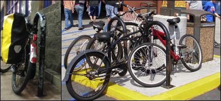 On the left, this ribbon rack is placed all of six inches away from the wall of a local pharmacy. It should support four independently parked bicycles, but as used here, it can support only one or two frame-locked bicycles without some detailed negotiations. Over on the right hand side, one of my favorite local supermarkets features this ribbon rack: It is crammed onto a small safety island feature that also supports a heavily buttressed light standard and a garbage can. Again, this rack should support four straightforwardly parked bicycles. Instead, wacky weave patterns, careful negotiations, and radical tilting angles are needed to avoid all the street furniture. In addition, the parked bikes are difficult to fit on the ends of the racks while keeping them on that pad. It's an even tighter squeeze on the side opposite the photographer--leading to bike wheels in the alleyway that motorists, cyclists, and pedestrians use to access this market. As if that weren't enough, this jumble of bikes is not unusual. The area is flat, the parking lot is miserably small, so many shoppers ride here.
The Library: The Racks are Different Here
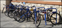 There are exceptions to these negligent and ignorant bicycle parking rack installation practices. One institutional example is the City of San Diego Public Library. It'd be prohibitively expensive in terms of bike riding time and bandwidth to travel to all thirty-five branch locations, the Adult Literacy Center, and the Central Library in downtown San Diego, but I do have a sampling. Let's lead off with Central Library. The array of bike parking brackets you can see on the left is about fifty feet from the public entrance. This may seem a bit far away, but Central, even with its wonderful wood and stone interior and soaring ceilings, is an old building whose replacement has been eagerly awaited for more than a decade. There simply isn't the sort of parking lot for cars that current construction mandates, or current motorists expect. The best you can do is the street, and much of that is metered in this heavily built-up area whose layout dates from horse and buggy days. The keenly observant may have noted these bicycle parking racks are set into a slight inset in the building. This keeps the sidewalk somewhat more clear. This is a good thing, as many wheelchair users are patrons of this library. Some bicycle parkers use signposts in front of the library as extempore bike parking facilities--and it is obvious just from the examples of a few that extensive bike parking right there in front of the entrance, even at curbside of this wide sidewalk, could clog up and somewhat obstruct the area.
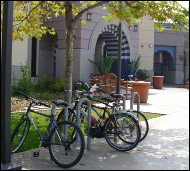 If you'll be riding on over to the Serra Mesa-Kearny Mesa Branch Library at 9005 Aero Drive, San Diego, CA 92123, you'll find the bicycle racks are as close to the door as any of the motor vehicle parking spots. Further, with two ribbon racks (see picture on the right for details), you'll still find room to park your bicycle even if a group of children or a family from some of the nearby housing developments has ridden here. Aero Drive features a nice class two bikeway ("bike lane"), as do many of the arterial roads intersecting with it. This is is a continuation of the basic theme from commercial developments with which I led. The library's planners are not immune to the impulse to place bike parking facilities someplace where they won't be in the way--but they have unobtrusive places near the entrances where they're willing to place racks.
On the left, you'll see the bicycle racks at the Linda Vista Branch Library, 2160 Ulric St., San Diego, CA 92111. You'd think these racks continue the theme of placing bicycle parking facilities further away from entrances than any car slots, but when you're at the site, you'll see that these two ribbon racks, although placed at the far edge of the library's walkway, 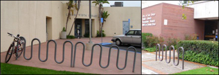 are actually as close or closer to the entrance than any motor vehicle parking, with the exception of some handicapped parking spaces.
On the right, the Tierra Santa Branch Library's parking are, again, in a location where they won't obstruct anything, but are closer to the entrance than any vehicle parking. It's a matter of architectural design. Good architects know that people do more than go in and out of libraries at the entrances: They arrange their loads of books and other media, they don or doff hats, gloves, and outerwear, they meet or wait for companions, they pause as they fish for their vehicle or bicycle lock keys. Further, this is in Southern California. Architects have worked for decades easing, smoothing, or crossing over the barrier between "inside" and "outside," simply because we have so much hospitable weather here. The large walkway aprons are not simply for the convenience of patrons and groups of patrons, or for an Italianate "piazza" effect. They allow for outdoor presentations and programs, giving solid footing to people and props. They also create conveniently "out of the way" spaces with plenty of clearance for bike rack installation relatively close to those library entrances.
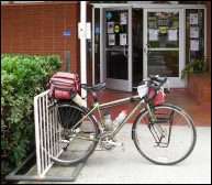 If you've been paying attention, you'll have noticed most of the libraries I've featured thus far are relatively new. The Serra Mesa-Kearny Mesa Branch Library, for example, has been open for only four years. However, older library branches featuring outdated racks still tend to have those racks in convenient parking locations. The Clairemont Branch Library at 2920 Burgener Blvd., San Diego, CA 92110 is an example. The library building itself is only slightly more recent than the old Central Library. Unlike the Central Library's relatively recent blue-painted brackets, the Clairemont rack is this old, welded steel "wheel bender" grid rack. Despite its old-school, much-maligned design, this rack is closer to the entrance than any motor vehicle parking. It's not secured to the ground as well as cemented-in-place ribbon racks, but it is a very heavy rack. Anyone who tries to walk off with it and a bunch of bikes deserves the hernia.
Shopping center managers may not understand cyclists or their needs, if they even think of them before they get complaints from merchants about folks locking to railings and leaning bikes against windows. On the other hand, service organizations such as public libraries seem much better able to plan for nice bike parking. In part, while retailers seek preferentially to accommodate bulk consumers of goods, such as credit-card-packing adults driving SUVs and minivans, libraries justify their existence with the sort of clients shopping centers want to discourage--those meddling kids, the neighbors strolling over from across the street, people who just want to borrow something, and folks who are simply stopping by to download pictures of bicycle parking facilities.
Text & photos by Robert Leone
